In a Nutshell: Financial questions abound in life, and answers aren’t necessarily easy to find or interpret. HowMuch.net lends a hand by turning massive data sets into easy-to-understand visual representations. In addition to graphics on financial topics, HowMuch.net also hosts cost guides and a cost-of-living tool to help users better manage their money. With every visualization and feature, HowMuch.net strives to take a creative approach to interpret reliable information.
For recent college graduates, searching for a job and getting started on the rest of their lives can be daunting tasks. First, they must do the research necessary to answer essential questions about the salary they can expect from a profession, the best companies to work for in that field, and the cost of living, — including housing — in a city.
The goal of HowMuch.net is to make that task — and many others — less cumbersome by providing straightforward answers to important financial and economic questions.
“People don’t like looking at a pile of numbers. It’s a bit boring to look at big spreadsheets and try to understand all of these data sets,” said Raul Amoros, Director of Content Development for HowMuch.net. “Our goal is to get people interested in that data and make it more accessible.”

Many organizations — such as the UN, the World Bank, and the IMF — release useful, high-quality reports, all of which are free and open to the public. However, the information they contain often remains inaccessible due to its format.
“You need to be an economist or a statistician to get an idea of what those piles of numbers are saying,” Amoros said. “We decided to take a look at different sources, and try to help people understand what those data sets are about.”
HowMuch.net turns those reams of numbers into easy-to-understand visualizations. Its process transforms static information about money and economics into a more dynamic and compelling medium.
And all of these visual interpretations are — like the data on which they’re based — free and available to consumers. HowMuch.net represents a straightforward and entertaining tool for financial education and self-improvement.
Improving Comprehension with an Innovative Approach to Data Delivery
One example of HowMuch.net’s unique approach to data visualization is its use of Voronoi diagrams, which Amoros said have become something of an unofficial trademark of the site. Voronoi diagrams are similar to pie charts; they represent the relationships of data points through color, shape, and space.
However, rather than radial segments, Voronoi diagrams represent information through interlocking, irregular shapes, as can be seen in a visualization of the global economy by area.
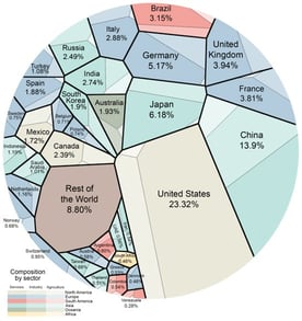
HowMuch.net’s graphics distill data sets into beautiful, easy-to-understand visuals.
“This kind of diagram became really popular. We didn’t invent the Voronoi diagram, but we started using them, and that is a good example of how we break the rules inside of the data visualization community,” Amoros said. “Nobody else is making diagrams like this, and our users like it.”
Another example that challenges industry norms is HowMuch.net’s map of projected economic growth through 2024, in which a nation’s physical size represents the expected expansion. Other visualizations might display the same information through color rather than through size comparison.
“For them, this is breaking a rule. For us, it’s making clearer what the data is trying to show. We aim to create unique, beautiful, and compelling content,” Amoros said. “The average reader doesn’t have time to get into data and try to understand what that data is trying to say.”
HowMuch.net’s goal is to ensure easy and quick comprehension of data. A reader should understand the main point of visualizations in under three minutes. For those with additional time to spend and an interest in learning more, HowMuch.net links to each visualization’s data source in its accompanying article.
Enhancing Financial Education through Visual Learning
Many of HowMuch.net’s visualizations focus on large-scale economic concerns, but it also produces resources useful for financial education and planning. These include cost-of-living guides and an interactive tool, and various features on consumer and professional issues.
HowMuch.net has produced cost guides on many home remodeling projects as well as business insurance. Amoros said HowMuch.net is working to develop this format further, with upcoming topics to include mortgages and insurance.
“They’re a 1.0 version of what we want to reach. In early 2019, we are going to be producing a lot more of these cost guides,” Amoros said. “We’re aiming for these cost guides to be educational, helpful, and easy to understand.”
The cost-of-living tool also provides a wealth of information tailored to an individual situation. The tool requires two main inputs: Your socioeconomic category and the city you live in — or want to live in. Users can choose from options that include stay-at-home mom, young family, or customize their own category. They may also add details like family size, profession, food plan, and desired home size.

The interactive cost-of-living tool on HowMuch.net is a vital feature for those considering relocation.
Based on this information, the tool calculates an expected income, taxes, and the costs of housing, food, child care, health care, and transportation. This information is based on data from various sources, including the U.S. Department of Agriculture, Consumer Expenditure Surveys, and Renthub.com.
“We’re really proud of this tool,” Amoros said.
According to Amoros, it is currently 90% accurate, and HowMuch.net is working to achieve 100% accuracy.
The site also publishes more focused visualizations to help consumers understand and address their financial concerns. These include gas-mileage rankings for the top 10 American automobiles, the 50 best jobs in America in 2019, and household economic security by state.
Amoros recommends HowMuch.net’s compilation of its best visualizations of 2018, which includes the most profitable industries by state and the most valuable global brands.
The Visualization Process: From Raw Data to Web Graphic
HowMuch.net gathers data from more than 200 sources and is always discovering new ones. “We have someone who is in charge of going through the news and sites that we know publish data,” Amoros said. “We set alerts everywhere on Google, so when there is a new data set, we’re probably going to be some of the first people to find out it is available.”
Visualizations typically take between seven and 15 hours to produce. The data must be analyzed, the graphics planned and created, and social media and outreach content must be drafted before its release. To accomplish all that efficiently, the HowMuch.net team takes an open, collaborative approach.
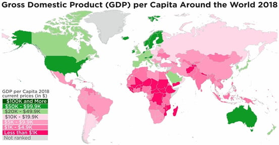
HowMuch.net visualizations take between seven and 15 hours to produce, which helps ensure accuracy.
“We try to be creative every time,” Amoros said. “Sometimes, it comes easily. I see the data, and I understand that it is perfect for a certain type of visualization. Sometimes, it doesn’t work. Other times you don’t realize it doesn’t work until you’re finished.”
But before any of that happens, HowMuch.net strives to ensure the data comes from reputable sources. After all, information is only as valuable as its accuracy. HowMuch.net strives to review all data for bias, even if it has already made a visualization.
“We have different steps in place to ensure data comes from reputable sources,” Amoros said. “About 99% of the time we get very reputable sets. And, if we make a mistake, we apologize, we take it down, and we keep moving.”
Increased Interactivity will Help HowMuch.net Provide More Relevant Information
HowMuch.net has been successful in increasing the accessibility of data and relevant financial information through its engaging visualizations and tools. And that success has meant plenty of recognition for the site itself.
“Every single week since we started the website, we have gotten attention from many magazines — including Market Watch or Business Insider or The Washington Post,” Amoros said. “Many of these outlets we never thought we could reach. They’re using our visualizations because they’re an easy way to understand complex data sets.”
And HowMuch.net plans to improve its offerings by producing more cost guides and enhancing its cost-of-living tool. The site will also improve its interactivity, particularly in the form of a pitch box. This will allow readers to submit ideas and recommend data sources for visualization.
“People are thanking us for making beautiful content that’s easy to understand. Some are even asking us for high-definition images so they can print them out and put them in their offices. Hopefully, we will offer users posters and canvases of our visualizations in the future.” — Raul Amoros, Director of Content Development for HowMuch.net
Amoros hopes this will encourage and improve communication between users and the HowMuch.net team. So far, the feedback has been overwhelmingly positive and encouraging.
“People are thanking us for making beautiful content that’s easy to understand. Some are even asking us for high-definition images so they can print them out and put them in their offices. Professors are asking us if they can use them for lectures in universities,” Amoros said. “We are exploring opportunities with some printers, and, hopefully, we will offer users posters and canvases of our visualizations in the future.”
It’s easy to see why this avenue of monetization is compelling for HowMuch.net. In addition to funding its ongoing work, distribution through print would promote even broader access to easy-to-understand visual interpretations of large data sets. And, in a world of pressing financial questions and complex calculations, that’s a win for everybody.
Advertiser Disclosure
BadCredit.org is a free online resource that offers valuable content and comparison services to users. To keep this resource 100% free for users, we receive advertising compensation from the financial products listed on this page. Along with key review factors, this compensation may impact how and where products appear on the page (including, for example, the order in which they appear). BadCredit.org does not include listings for all financial products.
Our Editorial Review Policy
Our site is committed to publishing independent, accurate content guided by strict editorial guidelines. Before articles and reviews are published on our site, they undergo a thorough review process performed by a team of independent editors and subject-matter experts to ensure the content’s accuracy, timeliness, and impartiality. Our editorial team is separate and independent of our site’s advertisers, and the opinions they express on our site are their own. To read more about our team members and their editorial backgrounds, please visit our site’s About page.
